Wednesday 27 May 2009

Regency Graphic Novel - Pages 5 - 8


More RGN pages, wondering what to do re: Regency flavoured sound effects...

Also, these are still covered in pencil marks and are in need of tweaks. Hey ho.

Sunday 17 May 2009

Regency Graphic Novel Cover


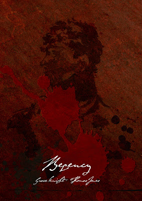
I know I may be getting ahead of myself a bit, but here's a cover idea. It's more of an exercise in establishing tone, rather than anything else. I had a very strong impression in my mind of what I wanted it to look like, i.e. a silhouette shot of George IV during his time as Regent, embossed on a leathery surface, with splatters of ink and wax/blood.

Bizarrely, a chap called Sir Thomas Lawrence had already painted an iconic side shot of George's side profile and thus very little work needed to be done. If you want to see the original... The font is from DaFont and is called Byron. Whether or not it's based on Byron's handwriting remains to be seen. I thought it looked cool.

Wednesday 13 May 2009

Regency Graphic Novel - Sample - Pages 3 & 4


Pages three and four. These were a bit rushed - as evidenced by the photoshopped colour on the apple and the abundance of pencil marks still visible. I'll keep working on the originals. Again, I've added more dialogue, but, as much to see what it would look like and where the bubbles would go etc. Still a super work in progress - I'm not convinced I've got the Regency knack yet.

Already, I think the Aunt is my favourite character. I don't know whether it's worth laouring how patently ridiculous Kitty's obsession with Captain Nash is - should it/can it be played for laughs or does that undermine everything?

Sunday 10 May 2009

Regency Graphic Novel - Sample - Pages 1 & 2


Here are the first two pages of the Regency Graphic Novel Blossom and I are writing/composing etc. The idea is: a sprawling, massive story with a buggerload of characters seen over the eleven years of the British Regency. This particular sequence takes place roughly half way through the entire thing, but it's the first point where these characters come into focus (although they'll all have been seen/mentioned elsewhere by now).

None of this is by any means final - I'm still not certain I like the watercolour and I need to do a hell of a lot more drawing to get the standard up to scratch, but this is an extremely long term project. The dialogue that exists now is super first draft, it's more there as a compositional detail at the moment - besides, the crummy little text boxes are difficult to adjust/tweak, so some of it may be a little unclear. Regardless, it's meant to be a bit jumbled.

What do people think?

Saturday 2 May 2009